If you are new to the design world, you may wonder about the fuss around design guidelines and how the rule of thirds is used in the design. It’s time to stop wondering and get right to the bottom. The rule of thirds in design is nothing new. It has been used by artists, designers, and photographers for more than 200 years. The rule of thirds in design and other forms of content creation is a universal phenomenon.
Interestingly, it is embedded in human vision naturally. You may be amazed, but it is a fact that we humans always focus on the left side of whatever comes into our view. Hence, the rule of thirds in design and photography is based on the same principle.
Designing is all about creating something that appeals to the eye. And to do that, proportions and symmetry play a very big role. The rule of thirds pretty much works like the Golden Ratio (1:1.618), aka Fibonacci Spiral, diverting the focus on any image to one side.
It creates a finer representation for the viewer; some say this is what divine proportions look like. Designers with a natural sense of art have an innate tendency to maximize the appeal of their creations to the user. Everyone has a natural orientation to visually scan any picture, design, or landscape in an F-shape. The eye focus naturally shifts to the top-left and bottom-left sides and then shifts to the top-right and bottom-right sides.
This benefits the designers as they can take advantage of this innate tendency of humans by making their designs captivating according to the human mind and eye. Whether sketching, taking a picture, designing manually, or using software, the rule of thirds in design remains invaluable to target the key points and communicate them to the user.
How Do Eyes Visualize the Rule of Thirds in Design?

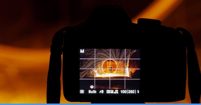
The rule of thirds in design, aka the golden rule, aligns the composition in a 3×3 grid. The composition is sectioned into nine imaginary boxes with four intersection spots called the sweet spots. The subject of focus is usually aligned at or near the focal spots. This makes the composition asymmetrical and interesting for the viewer. This rule is very common as we are naturally tempted to scan an image in F-shape distribution.
The technique is all about the placement of elements in your designs. The trick is to balance out your composition despite it being asymmetrical. It’s pretty simple, divide your design into three vertical and three horizontal sections and distribute the elements that look engaging and logical.
Rule of thirds in UI and UX
You can jump-start your design by framing the elements of your composition using the rule of thirds in the design grid. This composition makes more sense and does not look too stuffed or placed randomly. The outcome is a cleaner, focal point-oriented, and balanced design.
As a designer, you may have felt that a symmetrical image is perfectly balanced but lacks flow and movement. Too much symmetry makes the design rigid and boring. It means that asymmetry and balance do not oppose each other when composing an image. A static and symmetrical image feels like staring you down with a blank visual. However, putting an element on one side of the design can create a flow.
Rule of Thirds: A Winning Composition

So many software and applications now come with a built-in grid layout. These grid lines make it easy for a designer to place the elements on the canvas that look appealing to the viewer. The main subject of design may be placed within the central box of the grid and the supporting elements around the intersection points of the grid.
For instance, if you use the rule of thirds in designing your website, the standard screen resolution would divide the grid into rectangular boxes of 341×262 pixels. Most of your content falls in the top third grid line. The rule of thirds in graphic design for the landing page will help the viewers and readers to focus on the important information while visiting the website. This is exactly how most websites are composed and designed.
Furthermore, the rule of thirds in design states that a designer must place the core elements at one of the four sweet spots, i.e., focal points of interaction. If the composition is in a way that you cannot accommodate the elements on the focal points, they must be close to them. It’s not mandatory to compose the image by strictly following these rules. The designer may complete the design and can reposition key elements on the canvas in the end. The core idea is to make the visual interesting by making it unusual, energetic, and asymmetrical for the viewer’s eye.
Rule of Thirds vs. Golden Ratio in Design
Being a designer, you may have come across many rules and guidelines for design and composition. Similarly, the golden ratio is also a widely used design perspective. However, the rule of thirds in design is more popular than the golden ratio because it is easier to understand and execute. You can even label it as the bedrock on which all other compositional guidelines are based because it yields better results than the golden ratio. This is why it is the first thing explained to designers and photographers.
Conclusion
The rule of thirds in design is the easiest rule to follow; this is why it is popular among creators. This helps create aesthetically satisfying designs and images which attract more people. Many businesses use this rule to design and create content for their marketing campaigns as a tactic to gain customers. Aesthetics significantly change the perspective of the user or buyer for a composition or product. This is also known as the aesthetic usability effect. It works wonders.
The next time you design something for your brand, keep this rule in mind. And if you cannot do it by yourself, no worries. You can always come to Arturo Digitals’ doorstep to avail the best graphic design services at the best possible price.